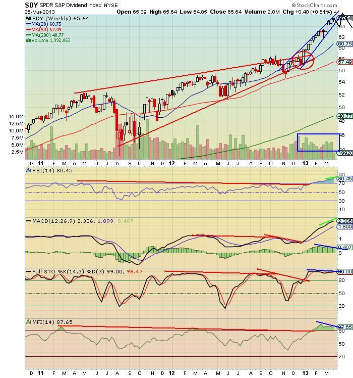
The red lines show the rising wedge, overbot conditions and negative divergence, textbook TA pointing to a serious collapse, then, instead, the fiscal cliff resolution occurs to stop the failure. Bulls were given a huge gift to start the year. The pumping is reaching a feverish pitch now and the charts are prone to topping and rolling over. It will be interesting to see what all these folks do, that chased divvy stocks with hot money, once the dividend stocks start to sell off. This information is for educational and entertainment purposes only. Do not invest based on anything you read or view here. Consult your financial advisor before making any investment decision.
No comments:
Post a Comment
Note: Only a member of this blog may post a comment.